# Is the Pudgy Penguins Price Breakout Real? The Data Behind the PENGU Rally
The chatter around the Pudgy Penguins crypto token, PENGU, has reached a familiar pitch. After a prolonged downtrend that tested the patience of even its most ardent supporters, the price has shown signs of life, surging over 12% in a recent session, prompting reports titled Pudgy Penguins (PENGU) Price Rises 12% After Prolonged Downtrend — ATH Likely Before 2025 Ends. The usual chorus of analysts is calling for new all-time highs, pointing to bullish chart patterns and whale activity. It’s a compelling story, but stories don’t move markets. Data does.
My job isn’t to cheerlead. It’s to dissect the numbers and separate the signal from the noise. The core question is simple: Is this recent price action the beginning of a sustained rally, or is it a statistically insignificant blip in a larger corrective phase? To answer that, we need to look past the headlines and examine the underlying structure of this supposed recovery. The bullish case for the Pudgy Penguins coin rests on three distinct pillars: technical chart formations, on-chain accumulation data, and a series of corporate partnerships designed to build a mainstream brand. Let’s stress-test each one.
The Anatomy of a Breakout Signal
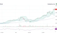
From a purely technical standpoint, the bull case has merit. The PENGU price chart shows a clean break from a falling channel, a classic pattern that often signals the exhaustion of selling pressure. You can almost see the tension on the chart—a coiled spring of price action pressed against the descending trendline before it finally snapped upward. Following this, the price successfully retested that same trendline, turning what was once resistance into a new floor of support. This is textbook technical analysis; it’s the kind of setup traders look for to confirm a reversal.
The critical level everyone is watching now is the support zone between $0.030 and $0.031. Holding this line is non-negotiable for the bulls. If the price remains above this foundation, the path to retesting higher resistance at $0.036 and eventually $0.043 seems plausible. Some analysts are even eyeing the $0.06 to $0.07 zone if a bullish flag pattern on the higher time-frame chart plays out. The structure is there, clean and legible.
But here’s the necessary dose of skepticism. Technical patterns are about probabilities, not certainties, and their reliability can degrade in the highly reflexive environment of memecoins, where narrative can overwhelm fundamentals in an instant. The recent surge was around 12%—to be more exact, 12.4% at its daily peak—but the token remains 46% below its all-time high. A single day's rally, however encouraging, doesn't erase weeks of downward pressure. The breakout is a positive signal, but it’s just one data point. Is there anything more substantial under the hood?

Beyond the Charts: Corporate Moves and Whale Wallets
This is where the story gets more interesting. The on-chain data presents a far more compelling picture than the charts alone. The Holder Accumulation Ratio has reportedly surged to 86.14%. For the uninitiated, this metric tracks whether active wallets are, on balance, buying or selling. A reading above 50% indicates net accumulation; a reading over 85% suggests a near-unanimous conviction among active participants that prices are headed higher. This isn't just retail enthusiasm; this is a stampede.
Corroborating this are reports of significant outflows from Coinbase Prime wallets. I've analyzed on-chain flows for years, and this level of sustained outflow from an institutional-grade wallet is not something you see every day. It suggests a coordinated accumulation strategy by high-net-worth individuals or funds (the so-called "whales") who are moving their assets into cold storage for a long-term hold. This systematically reduces the available supply on exchanges, creating a floor for the price and amplifying the effect of any new buying pressure. This, in my view, is the strongest piece of evidence in the bullish thesis.
Then we have the partnerships. Pudgy Penguins has been aggressively pursuing a mainstream IP strategy, aiming to become what some have called "the internet's Mickey Mouse." Deals with Walmart and NASCAR are part of this push. More recently, a strategic partnership was announced with Sharps Technology (NASDAQ: STSS), a medical device company that has, in a rather curious pivot, remade itself into a "publicly listed Solana treasury." The official announcement, Sharps Technology and Pudgy Penguins Announce Strategic Partnership, is filled with the expected corporate jargon about "synergies" and "bridging blockchain innovation with mainstream culture."
But what does this partnership actually do? Sharps Technology recently acquired over two million SOL (valued north of $400 million) and its strategy involves generating yield from this treasury. The collaboration aims to integrate Pudgy Penguins' IP with STSS's treasury to create new opportunities for audiences. The specifics, however, remain vague. Is this a game-changing deal that will drive fundamental value, or is it a cleverly packaged press release designed to generate hype? It’s hard to say. The correlation between these announcements and sustained price increases is often tenuous at best. While brand building is crucial for long-term viability, it's a much noisier signal for short-term price prediction than direct on-chain supply and demand dynamics.
The Signal vs. the Noise
So, what’s the verdict? My analysis suggests we're looking at two very different types of data. The technical breakout and the corporate partnerships are the "noise"—they are visible, easy to talk about, and create a compelling narrative. They are important for sentiment but are lagging or, in the case of partnerships, speculative indicators of value.
The "signal" is the on-chain data. The overwhelming accumulation ratio and the systematic whale outflows from exchanges are direct, quantifiable evidence of a supply shock in the making. This is the data that matters. The bullish thesis for the Pudgy Penguins price doesn't rest on a chart pattern or a press release; it rests entirely on the conviction of large holders who are actively taking tokens out of circulation. The entire structure is predicated on defending that $0.031 support level. If that floor holds, the supply squeeze could do the rest. If it fails, the entire narrative structure built on top of it becomes irrelevant. The risk is concentrated, but the signal is clear.